On a Frame from "Monster-Scared"
Zarah Juul
Translated from the Danish by Katrine Øgaard Jensen
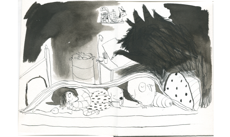
Sketch of spread seven from Monster-Scared
Monster-Scared is about a child who is afraid of the dark, unfamiliar sounds, and everything we cannot see or understand.
I was that child when I was young. When you're scared, your imagination runs wild, making things seem bigger and more threatening than they actually are.
Many of the images in Monster-Scared are based on my own childhood memories, of witches at the top of the stairs and monsters lurking in the dark corners of my room.
I’ve chosen to write about my process of creating spread seven. This spread shows our protagonist lying under the blanket, listening to the sounds in the room. The child imagines what's outside, on the other side of the blanket: the monster sketching a picture of the child in which the child looks really ugly—something that frightens the child to the point where they lie very still, barely daring to breathe.
I've lain like this myself, overwhelmed by imagination and fear. A fear I can now laugh at as an adult, since the idea of there being a monster is so absurd. I wanted my illustration to honor this fear that children have, while also giving them the opportunity to see their fear through my adult eyes, to laugh a little at the monster.
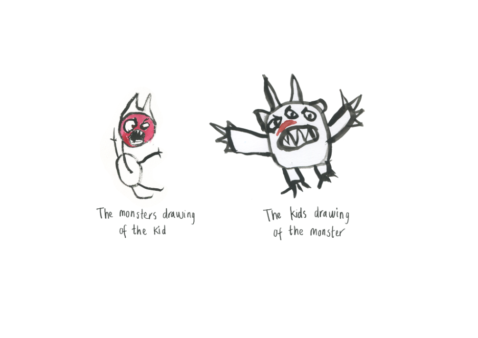
I wanted to illustrate the absurdity in Betina's text—the fact that the monster sits and draws a picture where the child looks really ugly—so children could see how silly and perhaps funny that would look. Ridiculousness can be useful in alleviating fear. Because of this, I went with a large shadow monster (which could be something else entirely) and a very naive drawing of the child. A menacing monster that draws like a small child can help make the monster seem less scary. The child describes it as drawn in an ugly way... but what does ugly mean? For children, “ugly” almost always means something different than what it would mean to an adult. I chose to depict an angry child, or a child trying to appear menacing. Because "ugly" can be "angry," and "scary" can be "sad" for children. Here, the child is depicted as menacing, just as we draw menacing monsters.
For inspiration, I looked a lot at my children's early drawings, as well as drawings made by other children in a monster workshop we held.
In my illustration, I also made the bed look very long to emphasize the feeling children can have of being small. The child is small in relation to their room, and far away from the door that leads to safety with mom or dad.
The entire book is drawn with ink, pen, and brush. I used the ink's depth and layered effect to give the Monster texture while still keeping it pitch black. I wanted it to resemble a shadow, but with hints of fur—like what the child is imagining, but something that could also just be a shadow.
I created several sketches and tests for how the monster would emerge from the shadow. I worked with the contrast between the room's dark corners and the safe hiding spot under the blanket.
In general, I used many different brushes and pens to create patterns and textures as counterparts to colored illustrations.
The final result can be seen here:


